

How to Build a High-Converting Video Landing Page (2026 Guide)

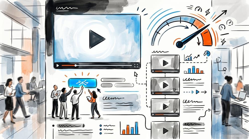
• A video landing page is a single-goal page built around one video that does the persuading, with everything else (headline, copy, CTA) arranged to support the watch-then-act sequence.
• Put the video above the fold, right next to your primary CTA. Match the video type to the goal: explainer for complex products, demo for SaaS, testimonial for trust, background loop for mood.
• Keep it short. 30-60 seconds for an offer, 60-90 seconds for an explainer or demo. One video per page, no distraction links.
• The hidden killer is page speed. A raw YouTube embed adds ~800KB+ before the first frame and can wreck your Largest Contentful Paint, so host the video in a way that loads fast and keeps visitors on your page.
A video landing page is a focused page with one job: get a visitor to watch a short video and then take a single action. The video carries the persuasion the way a salesperson would, and every other element on the page exists to set it up or follow through on it. Done right, it can lift conversions dramatically. Done carelessly, the video itself becomes the thing that slows your page down and pushes visitors away.
Most guides treat "add a video" as the whole strategy. It isn't. The video is one component in a deliberate structure, and the wins come from how you arrange that structure: where the video sits, which type you use, how long it runs, and how it's delivered to the browser. Get those four decisions right and the video has a real shot at lifting conversions. Get them wrong and you've added weight without lift.
This guide is the full blueprint, from the anatomy of the page down to the technical detail that decides whether your video helps or hurts. By the end you'll be able to build a video landing page from a blank canvas and know exactly why each piece is where it is.
What a Video Landing Page Actually Is (and What It Isn't)
A video landing page is not a regular page with a video added as decoration; the video carries the conversion argument, and the layout funnels attention toward pressing play, then the CTA.
That distinction matters because it changes every design decision. On a normal page, a video is supplementary. On a video landing page, the video is load-bearing. The copy above it earns the click to play. The CTA beside it captures the intent the video created. The proof below it removes the last doubt. Nothing competes with that sequence.
It also means a video landing page has the same discipline as any high-converting landing page: one page, one goal, one action. No navigation bar pulling people away, no five different offers, no link out to your competitor's YouTube channel. The hardest part of the conversion happened the moment they pressed play, so you protect that momentum all the way to the button.
The payoff is real. Marketers have long cited research that landing pages with video can convert meaningfully better than pages without one, and practitioner case studies routinely show double-digit lifts when the video is tightly matched to the offer. But those numbers only hold when the structure supports the video. A great video on a cluttered, slow page still loses.
How Do You Structure a Video Landing Page?
Every high-converting video landing page follows the same skeleton because it mirrors how a visitor decides: do I care, can I trust this, what do I do next.
Above the fold: headline, video, and CTA together
The first screen is where the decision is made. In most landing page tests, the headline and the hero asset directly beneath it carry disproportionate weight, because together they shape the visitor's first decision: stay or leave. That asset is your video. So the headline states the outcome, the video sits immediately below or beside it, and your primary CTA is within the same eyeful, never buried three scrolls down.
Pair the video with a strong static poster frame and a clear play button. Most visitors decide whether to watch based on that thumbnail alone, so treat it like a mini-headline: show a result, a face, or a moment of payoff, not a frozen mid-blink frame.
Below the fold: proof, then a repeated CTA
Once someone has watched, they're evaluating credibility. This is where social proof earns its spot: logos, a short stat, or one or two video testimonials as social proof. Keep testimonials to a supporting role here, the page is about your offer, not a testimonial reel. Then repeat the CTA. A visitor who scrolled past the first button and is now convinced shouldn't have to scroll back up to act.
The supporting cast: copy, FAQ, and a single exit
Beneath the proof, a compact block of copy reinforces the offer for the readers who skipped the video, and a short FAQ kills the last objections. The page ends with one action. No footer maze, no "explore more" carousel. Every link that isn't the conversion action is a leak.
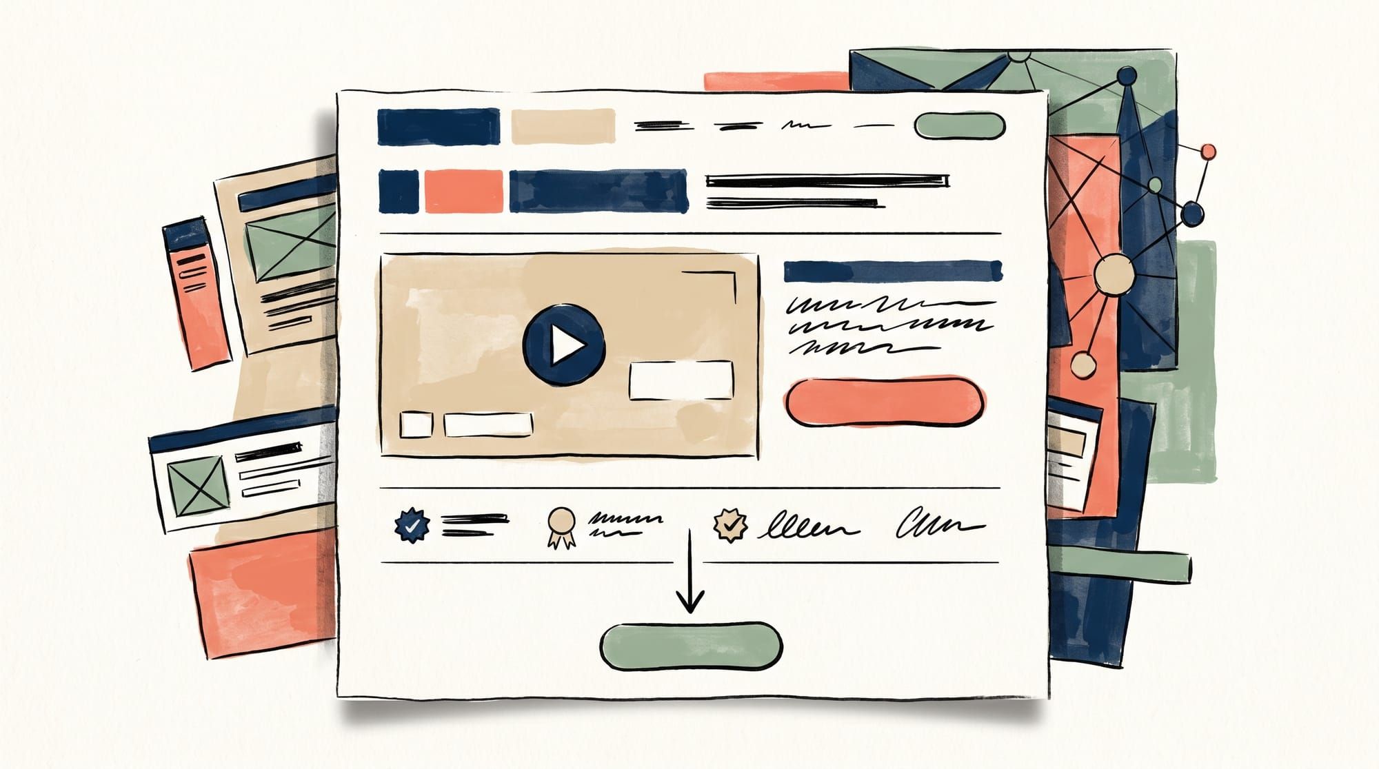
Video landing page best practices, at a glance:
- One page, one goal, one action.
- Video and CTA above the fold, next to the headline.
- A strong static poster frame instead of a frozen mid-blink thumbnail.
- One video per page, matched to the goal.
- Short runtime, captions on, and fast, lazy-loaded delivery.
- No navigation or outbound links competing with the conversion.
Which Video Type for Which Goal
The most common mistake is using the wrong type of video for the goal: a brand film won't close a SaaS trial, and a demo won't build trust. Match the format to the job.
| Goal | Best Video Type | Why It Works | Ideal Length |
|---|---|---|---|
| Explain a complex product | Explainer / animation | Simplifies an abstract value prop into a clear story | 60-90 sec |
| Sell software / SaaS | Product demo / screen walkthrough | Shows the "aha" moment in the actual product | 60-90 sec |
| Build trust for a service or coach | Trust-building (testimonial or founder-to-camera) | Real faces and specific results lower perceived risk | 30-60 sec |
| Promote a single offer or lead magnet | Short pitch / value video | One outcome, one ask, no wasted seconds | 30-45 sec |
| Set mood for a brand or product page | Muted background loop | Adds energy without demanding attention | 10-20 sec loop |
Notice that most of these are short. Conversion-stage viewers came to do one thing, and a long video gives them more chances to lose interest. One widely cited SproutVideo case study found that shortening a demo from four minutes to 90 seconds raised conversions from 2.1% to 8.3%. When in doubt, cut.
If your goal is a product walkthrough specifically, the rules tighten further. Our breakdown of product video best practices covers scripting the first five seconds, when to show the interface, and how to land the call to action inside the video itself.
Where to Put the Video, and Whether It Should Autoplay
Placement and autoplay are the two decisions people agonize over, so here are direct answers rather than "it depends."
Placement: above the fold, beside the CTA
Your hero video belongs in the first screen, paired with the headline and the primary button. Visitors shouldn't have to scroll to find the thing your whole page is built around. For longer pages, you can repeat that same video next to a relevant proof point lower down, but for most conversion-focused pages the hero slot should be the default.
Autoplay: muted-loop yes, sound-on no
For a background video, muted autoplay is fine and even expected. For a hero video that carries a message, use click-to-play with a strong poster frame. Sound-on autoplay almost always backfires: it startles people, and most browsers block or restrict it unless the video is muted. Let the visitor choose to start, then reward the choice with a fast, clean first frame. If you do use muted autoplay, always add a visible unmute control and captions for accessibility, because most autoplay viewing happens with the sound off.
One hard rule ties placement and type together: one video per landing page. Two videos split attention and double the page weight. If you think you need a second video, you probably need a second page.
How Does Your Video Host Wreck Page Speed?
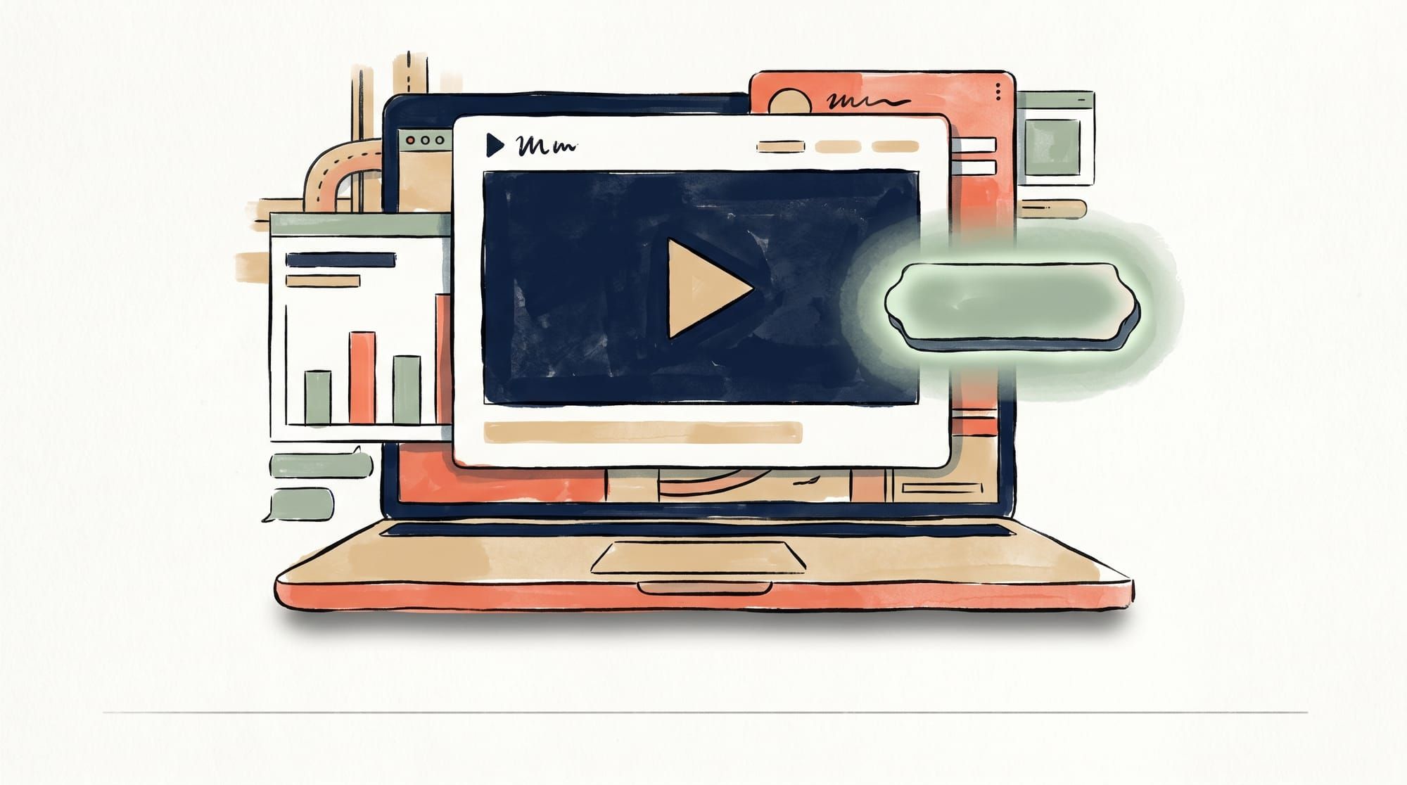
Your video host quietly decides whether the page converts, because landing pages live or die on the first impression, and a slow first impression is a lost visitor.
The numbers are unforgiving. Google's research found that 53% of mobile visitors abandon a page that takes longer than three seconds to load, and conversion studies repeatedly show that each additional second of delay shaves a measurable slice off conversion rate. On a landing page, where you've paid for every click, that's money walking out the door.
Now consider what a standard YouTube or Vimeo embed actually does. It can pull in hundreds of kilobytes of JavaScript, CSS, and tracking, often 800KB or more in real-world tests, before a single frame appears, and that payload competes with your headline and CTA for the browser's attention during the most fragile moment of the visit. The result is a slower Largest Contentful Paint, and because Core Web Vitals feed Google's page experience signals, a slow embed can cost you twice: once in conversions and once in search competitiveness. We've documented exactly why YouTube embeds hurt your website if you want the full teardown.
An undersized or undeclared embed also tends to shift the layout as it loads, hurting your Cumulative Layout Shift score and making the page feel janky right when you need it to feel trustworthy. And a YouTube player drags along its own baggage: branding, a related-videos panel at the end, and links to other channels, sometimes your competitors. Losing a prospect to a recommended video on your own conversion page is about the most expensive leak there is.
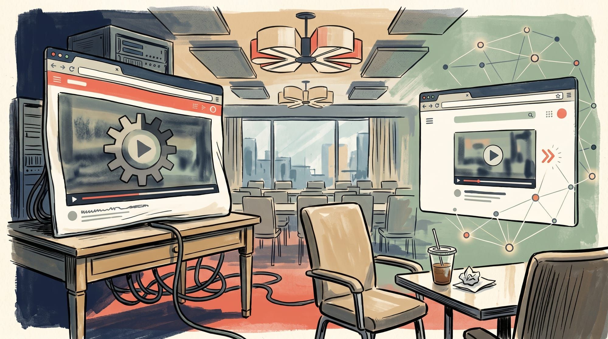
There are three ways to keep video fast on a landing page:
| Approach | Page Speed Impact | Trade-offs |
|---|---|---|
| Raw YouTube/Vimeo embed | Heavy (800KB+ before first frame) | Slow LCP, layout shift, competitor links, generic branding |
| Facade pattern (click loads the real player) | Light on load, heavier on click | Better LCP, but first play is delayed while the player downloads |
| CDN-delivered, lazy-loaded player | Minimal | Fast first frame and clean embed; monthly cost, less native YouTube discovery |
The facade pattern, swapping a lightweight thumbnail for the real player until someone clicks, is a solid free improvement and worth doing if you're stuck with YouTube. But it only defers the weight; the moment someone clicks, they wait. For a page whose entire purpose is to get the video watched, a purpose-built, CDN-delivered video that loads fast on both the page and the play click is the cleaner answer. If you're unsure what that even means, here's what a video CDN does in plain terms.
How Long Should a Landing Page Video Be?
Short. As a rule of thumb: 30-60 seconds for a single offer or lead magnet, 60-90 seconds for an explainer or product demo, and a 10-20 second loop for a muted background.
The reasoning is behavioral. Attention drops sharply after the opening seconds, and conversion-stage visitors are the least patient of all because they came to act, not to study, a pattern echoed across landing-page video conversion data. A tight video respects that. The widely referenced 4-minute-to-90-second case study above isn't an outlier; it's the pattern. Front-load the payoff, cut the throat-clearing, and end on the action you want.
The exception is genuinely high-consideration purchases where the buyer wants depth. Even then, lead with a short version and let the long version be a deliberate, signposted choice rather than the default.
Which Metrics Actually Matter?
A video landing page is testable in ways a static page isn't, but only if you track the right signals. Three metrics tell you almost everything:
- Play rate — the percentage of visitors who press play. Low play rate is a thumbnail, headline, or placement problem, not a video problem.
- Watch-through rate — how far into the video people get. A cliff at a specific second tells you exactly where to cut or rewrite.
- Post-video conversion rate — of the people who watched, how many took the action. This is the number that actually pays the bills.
The catch is that YouTube embeds hand you almost none of this at the page level; you get YouTube's view of YouTube, not your funnel. A hosting solution built for websites gives you play rate, engagement heatmaps, and drop-off data tied to your page, which is what makes iterative testing possible. From there, run one change at a time: test the thumbnail, then the length, then placement, then the CTA wording. Single-variable tests, the way the best CRO teams work, so you actually learn what moved the needle.
Speed belongs in your measurement too. If conversions are soft, check your Core Web Vitals before you blame the creative, because a slow video is a big problem that masquerades as a weak offer. And if you're embedding the same video elsewhere, make sure you can embed it without ads or branding so the experience stays consistent with your landing page.
Build the structure, match the video to the goal, keep it short, and deliver it fast. That last part is the one most teams miss, and it's the one SmartVideo was built to solve.